Note
Go to the end to download the full example code.
Charts as graph visualisations#
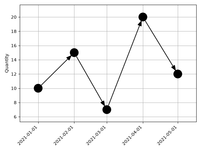
This example shows how to use iplotx to display changes of a quantity over time.
This is a kind of chart that would not usually be considered a graph, but can be
reinterpreted that way to make use of iplotx’s visual capabilities.
import datetime
import networkx as nx
import matplotlib.pyplot as plt
import iplotx as ipx

times = ["2021-01-01", "2021-02-01", "2021-03-01", "2021-04-01", "2021-05-01"]
quantity = [10, 15, 7, 20, 12]

# Convert the date strings to numbers because iplotx does not understand dates
dates = [datetime.datetime(*list(map(int, t.split("-")))) for t in times]
days_since_start = [(d - dates[0]).days for d in dates]

g = nx.path_graph(len(quantity), create_using=nx.DiGraph)
layout = {i: (days_since_start[i], quantity[i]) for i in range(len(quantity))}

fig, ax = plt.subplots()
ipx.network(
    g,
    layout,
    ax=ax,
    strip_axes=False,
    zorder=2,
)
ax.set_xticks(days_since_start)
ax.set_xticklabels(times, rotation=45, ha="right")
ax.set_ylabel("Quantity")
ax.grid(True)
fig.tight_layout()
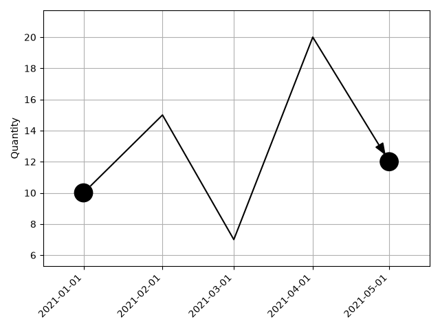
This can also be done in another way by using a single edge:
g = nx.DiGraph([(0, 4)])
fig, ax = plt.subplots()
ipx.network(
    g,
    layout,
    ax=ax,
    strip_axes=False,
    zorder=2,
    edge_waypoints=[[
        layout[1],
        layout[2],
        layout[3],
    ]],
)
ax.set_xticks(days_since_start)
ax.set_xticklabels(times, rotation=45, ha="right")
ax.set_ylabel("Quantity")
ax.grid(True)
fig.tight_layout()
Total running time of the script: (0 minutes 0.153 seconds)